top of page

Erika Heitkamp
Welcome to my graphic design portfolio. I specialize in creating visually stunning and interactive designs that bring ideas to life.
About
I'm a graphic designer with a passion for bold visuals, clean layouts, and thoughtful storytelling. Explore a curated collection of my work, from branding and print to digital design. Each piece I have crafted with creativity and purpose. Let’s bring ideas to life, one design at a time.

Work
My Portfolio
Doechii Poster Design
I created a poster design for Doechii inspired by her Alligator Bites Never Heal album and her bold Y2K aesthetic. The design blends edgy, experimental elements with playful retro nostalgia, reflecting her dynamic persona and genre-bending style. I incorporated glossy textures, metallic accents, and pixel-style typography to channel early-2000s pop vibrancy, while using sharp graphic motifs inspired by the album’s fierce alligator symbolism. The color palette mixes neon tones with deep greens and purples to echo both the Y2K vibe and the album’s emotional depth. Overall, the poster captures Doechii’s fearless creativity, blending futuristic flair with nostalgic rebellion.


National Park Postcard
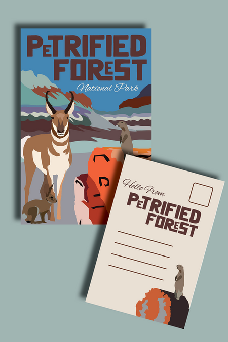
I designed a postcard for Petrified Forest National Park that draws inspiration directly from the park’s breathtaking natural palette and wildlife. The design features warm desert tones, rich earthy reds, and muted turquoise hues, reflecting the colors of the petrified wood, ancient rock formations, and expansive skies. Subtle illustrations and silhouettes of native wildlife, such as lizards and desert birds, add an authentic and organic touch. The layout is clean yet artistic, capturing the park’s timeless beauty while evoking a sense of adventure and natural wonder, making it both a keepsake and a visual tribute to the park’s unique landscape.


Senior Design Campaign
Fit Flip is a senior design campaign centered on sustainability, upcycling, and reducing the environmental impact of clothing production. The campaign encourages a shift in mindset, from fast fashion to conscious fashion, by promoting creative ways to flip and rework existing garments into new, wearable pieces.
The visual direction features a modern, clean aesthetic paired with bold, adaptable layouts that reflect the transformative nature of upcycling. Campaign assets included social media graphics, poster designs, an interactive website concept, banner designs, and a branding guideline.
The visual direction features a modern, clean aesthetic paired with bold, adaptable layouts that reflect the transformative nature of upcycling. Campaign assets included social media graphics, poster designs, an interactive website concept, banner designs, and a branding guideline.


Nissan Spring Sales Event
I designed a fresh and vibrant logo for Nissan’s Spring Sales Event, capturing the essence of renewal and excitement with a clean, modern, and seasonal aesthetic. The logo combines sleek automotive elements with subtle spring-inspired visuals to communicate both the brand’s professionalism and the limited-time promotional energy.
Building on that visual identity, I created a cohesive set of marketing materials, including a postcard, website slide, and external advertisement. Each piece maintained consistent branding, color palette, and typography to ensure strong recognition across all platforms. The designs were optimized for clarity, visual appeal, and call-to-action effectiveness, helping attract customers, boost engagement, and enhance overall campaign visibility.
Building on that visual identity, I created a cohesive set of marketing materials, including a postcard, website slide, and external advertisement. Each piece maintained consistent branding, color palette, and typography to ensure strong recognition across all platforms. The designs were optimized for clarity, visual appeal, and call-to-action effectiveness, helping attract customers, boost engagement, and enhance overall campaign visibility.


Free People Movement Annual Report
This conceptual annual report was designed for Free People, focusing on their activewear line, Free People Movement. The design combines bold visuals, clean data presentation, and a vibrant, earthy color palette to reflect the brand’s energetic and wellness-driven identity. It highlights key metrics, sustainability efforts, and community impact, balancing style with clear communication.


Amazing Joe's Football Tshirt
I created a football-themed T-shirt design for Amazing Joe’s in Muncie that captures both local team spirit and the restaurant’s bold personality. The design features dynamic football imagery with strong, energetic typography, incorporating Muncie pride elements to appeal to local fans. I used bold, eye-catching graphics and the restaurant’s brand colors to maintain consistency and recognition. The overall look is fun, spirited, and fan-friendly, perfect for game days, staff wear, and customer engagement.


Sabrina Poster Design
I designed a Sabrina Carpenter poster that reflects her soft, dreamy aesthetic by using her signature color palette of light tan and soft blue. The overall design emphasizes a calm and delicate tone, incorporating smooth gradients, elegant typography, and subtle overlays to maintain a gentle, airy feel. The imagery and layout highlight her personality, stylish, graceful, and authentic, while keeping the composition clean, modern, and visually appealing.


Gutter Bros Logo
-Designed a clean, professional logo for Gutter Bros that reflects reliability and quality
-Ensured the logo was visually engaging without being too plain or overly complex
-Balanced strong typography with subtle gutter-themed elements for brand recognition
-Created a matching promotional flyer to maintain consistent branding
-Highlighted key services, contact information, and unique selling points to attract new customers
-Delivered a polished and modern brand identity suitable for both digital and print use


Esthetician Social Media Post
Designed visually appealing and branded social media posts to promote spa services
Highlighted key offerings such as facials, massage therapy, lash extensions, and skincare treatments
Showcased client transformations, spa atmosphere, and professional expertise
-Created content that included promotions, educational skincare tips, and seasonal offers
-Used engaging captions and strong call-to-actions to encourage bookings
-Helped increase online presence and drive more direct inquiries and appointments through social media


Downtown Farmstand Rebrand
Led a full creative rebranding to modernize Downtown Farmstand’s visual identity.
Redesigned logos, packaging, signage, and marketing materials to reflect the brand’s organic, local, and sustainable mission.
-Created cohesive design templates for flyers, menus, event promotions, and social media content.
-Enhanced brand recognition and customer engagement through visually consistent and appealing designs.
-Successfully aligned visual branding with community-focused farm-to-table values.


Sleeping Pad Product Design
I had the opportunity to lead the design of both the logo and packaging for a product listed on Amazon. The client was looking for a visual identity that struck the right balance between professionalism and an outdoors-inspired aesthetic. My goal was to create a clean, modern logo that would resonate with customers while clearly reflecting the product’s connection to nature and outdoor use. The final design successfully blended these elements, helping to establish a strong and appealing brand presence in a competitive marketplace.


Food Truck Design
During the fall semester of my senior year, we were tasked with selecting a business of our choice and designing a truck concept for both advertising and service purposes. I chose The Caffinery, a local coffee shop whose branding I already admired. My focus was on building a cohesive and visually engaging food truck design by thoughtfully integrating elements of their existing brand identity.


Erika's Day in Jamaica Children's Book Design
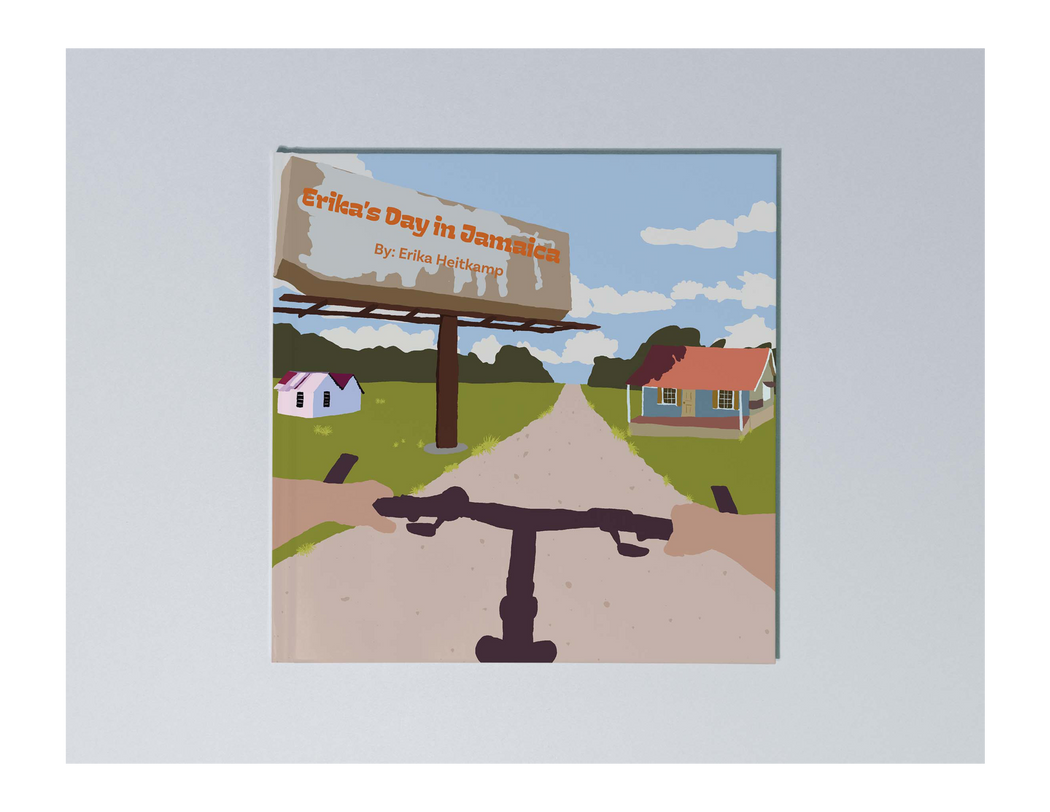
This project is a culturally rich children's book titled Erika’s Day in Jamaica, told from my personal point of view. The story captures a day in Jamaica through the eyes of a child, blending vibrant illustrations with authentic cultural elements like food, music, language, and daily life. Designed to resonate with young readers, especially those navigating life between two cultures, the book explores what it’s like growing up in America while staying connected to Jamaican roots. The goal was to celebrate identity, heritage, and the beauty of cultural storytelling through playful, engaging visuals.


Museum Disability App
This project focuses on designing an inclusive museum app tailored for individuals with visual impairments. The app enhances the museum experience by offering audio descriptions for artworks, a simple keypad feature to enter artwork codes, and large, high-contrast text for improved readability. The goal was to create a user-friendly, accessible tool that allows all visitors to engage more deeply with art through thoughtful, intuitive design.


2026 Cat Calender
This was a self-directed and self-initiated project I developed during my senior year at Ball State. My goal was to create something both enjoyable and outside the scope of my previous design experience. I illustrated each month individually and incorporated moon phases into every layout. Upon completion, I also produced a physical copy of the final design.


bottom of page